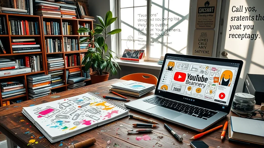
The Visual Symphony: Harmonizing Colors and Fonts
Alright, let’s dive into the fun part—colors and fonts! This is where your banner can really start to sing. Think of it like creating a playlist for a party. You want the right vibe to keep folks engaged, right? Well, colors and fonts are your DJ and light show, mixing together to create that perfect atmosphere.
First up, colors! It’s wild how colors can totally change the mood of your banner. You’ve got your bold reds and yellows that scream excitement, while blues and greens can be more chill and soothing. If you’re going for tech vibes, maybe lean towards some cobalt blues or sleek grays. They give off that modern, high-tech feel. But hey, don’t be afraid to throw in a pop of color to catch the eye! A bright orange or neon green can really make things stand out.
- Consider your audience: What colors might resonate with them? If your tech content is aimed at gamers, maybe some darker, edgier tones could work.
- Consistency is key: Try to stick with a color palette that matches your brand. You don’t wanna look like a rainbow exploded on your banner.
- Test it out: Sometimes what looks great on your screen might not work in the real world. So, grab some friends (or your cat) and ask for their opinions!
Now, onto fonts! Choosing the right font is kinda like picking your outfit for a date—you want it to reflect your personality but also be legible. No one wants to squint at your banner trying to figure out what it says. Keep it simple, folks! A sans-serif font usually works well for tech-related content because it’s clean and easy to read. But hey, if you want to get a little funky, maybe mix a more decorative font for your channel name with a simpler one for the details.
Also, don’t overload your banner with too much text. Remember, less is more! You want your audience to get the gist of what you’re all about without feeling like they’re reading a novel. And if you can, try to balance your text with some visuals. A good rule of thumb is to keep your fonts to two or three different styles at most. Your banner isn’t a circus, after all!
At the end of the day, harmonizing colors and fonts is all about finding what feels right for you and your channel. It’s like cooking—taste as you go! Change things up if it doesn’t feel right. You’ve got this!
Crafting Your Brand’s Signature: Icons and Imagery That Speak
Alright, let’s dive into one of the fun parts of designing your YouTube banner: the icons and imagery that really make your brand pop! Think of your banner as your online handshake—it’s the first thing people see, and you want it to be memorable, right? So, let’s talk about how to choose visuals that not only look good but also say something about you and your content.
First off, you gotta think about your niche. If you’re all about tech reviews, sleek and modern visuals are probably your jam. On the other hand, if you’re doing DIY projects, maybe some colorful, playful graphics fit the bill better. Choose icons and images that resonate with your audience. It’s like dating; you wouldn’t show up in a tuxedo to a casual coffee date, would you?
- Consistency is Key: Make sure your icons and images align with the overall vibe of your channel. If you’re going for a clean, minimalist look, don’t throw in some random, busy images. It’ll confuse people faster than a cat in a room full of rocking chairs.
- Color Matters: Colors evoke emotions, man. A vibrant red might scream ‘excitement’ while a cool blue says ‘trustworthy.’ Think about what feelings you want to stir in your viewers. If you want them to relax and binge-watch your content, maybe go for softer hues. Just don’t go all rainbow on them unless that’s your thing!
- Icons Tell Stories: Use icons that encapsulate what your channel is about. A little camera for vlogging, a game controller for gaming, or a laptop for tech discussions. They’re like visual shortcuts, leading folks to understand your channel’s essence without needing a long-winded explanation.
Don’t shy away from using images of yourself or your workspace, either. It adds a personal touch and helps build a connection with your audience. Plus, who doesn’t love seeing the face behind the voice? Just remember, it’s all about authenticity. People appreciate realness over perfection any day.
In the end, your banner should be a reflection of you. It’s your space to be creative and showcase what you love. So, take your time, experiment a bit, and don’t forget to have fun with it! After all, if you’re not enjoying the process, what’s the point?
Telling Your Story: The Power of Taglines and Text Placement
Alright, let’s talk about taglines and text placement, because honestly, they can make or break your YouTube banner. I mean, we all know that first impressions count, right? When someone lands on your channel, you want them to instantly get a sense of who you are and what you’re all about. That’s where a catchy tagline comes in.
A tagline is like your channel’s elevator pitch. It should be short, snappy, and memorable—kind of like that one friend who always has the best one-liners. You want to convey your vibe and what viewers can expect from your content. For example, if you’re all about tech reviews, something like “Tech Unboxed: Where Gadgets Come to Life” could work wonders. It’s fun, it tells a story, and it’s clear what you’re offering.
Now, let’s not forget about text placement. You could have the best tagline in the world, but if it’s buried in the corner where no one can see it, what’s the point? Think about the hierarchy of information. Your channel name should pop, and your tagline should be close enough that it supports your main branding without overshadowing it. It’s like a good sandwich; you need the right layers to make it delicious!
- Keep it readable: Use fonts that are easy on the eyes. Fancy script might look cool, but if no one can read it, what’s the point?
- Contrast is key: Make sure your text stands out against the background. If your banner’s all dark colors, try a light font. It’s like wearing a black shirt and expecting people to see your name tag—ain’t gonna happen!
- Don’t overcrowd: Less is more, folks. You don’t want your banner looking like a yard sale explosion. Stick to the essentials.
And hey, if you’re feeling adventurous, try experimenting with text placement. Sometimes, moving a tagline a few pixels can make a world of difference. It’s like rearranging your furniture; sometimes it just clicks, and you wonder why you didn’t do it sooner!
So, when designing your YouTube banner, remember to tell your story with your tagline and be strategic about where you place that text. It’s all about creating a welcoming vibe that’s uniquely you. Trust me, your future subscribers will appreciate it!
A/B Testing Your Masterpiece: Iterating for Maximum Impact
Alright, so you’ve put your heart and soul into designing the ultimate YouTube banner. It’s a masterpiece—at least, you think so. But before you go shouting from the rooftops, “Look at my beautiful banner!” consider this: A/B testing. Yeah, I know, it sounds all fancy and techy, but it’s really just a smart way to see what works best.
Here’s the deal: A/B testing is all about comparing two versions of something to see which one performs better. In your case, that means creating two different banners. Maybe one has a bold color scheme, while the other’s a bit more subdued. You could even switch up the fonts or the call-to-action. The possibilities are endless, and honestly, that’s half the fun!
- Pick Your Variables: Decide what you want to test. Is it the image? The text? The overall vibe? Choose wisely, my friend.
- Use a Reliable Tool: There are plenty of tools out there that can help you with A/B testing, like Google Optimize or even some built-in YouTube analytics features. Just don’t try to do it all on your own—your brain might explode.
- Gather Data: Once you’ve launched both banners, sit back and watch the magic happen. Or, ya know, the data roll in. Look at the engagement metrics, click-through rates, and overall viewer interaction. It’s like being a detective, but instead of solving crimes, you’re solving the mystery of what your audience loves.
After you’ve gathered your data, it’s time to analyze. Which banner got more clicks? Did people stick around longer with one over the other? This is your chance to see what resonates with your audience. And hey, if one banner totally flops, don’t sweat it! It’s all part of the creative process.
Now, you might be thinking, “Ugh, more testing? Can’t I just have my beautiful banner?” I get it. But trust me, taking the time to iterate will pay off. It’s like fine-tuning a guitar before a big show. You want everything to sound just right. So, roll up your sleeves, embrace the testing phase, and get ready to create a banner that not only looks great but also brings in those viewers!


